Zammad UI
The user interface (UI) of Zammad is designed to provide an intuitive experience for users. It is built around the concept of simplicity, clarity, and accessibility and is based on common software design principles which should make the UI pretty self explanatory.
There are basic modular components for different features to keep the UI consistent. These components are described in the sections below. Depending on the currently opened screen, there are interactive components, such as tooltips and a contextual help. Use them wherever needed.
Overview
The screenshot below shows the Zammad UI with the ticket detail view opened. Read on for a description of the different main elements of Zammad.
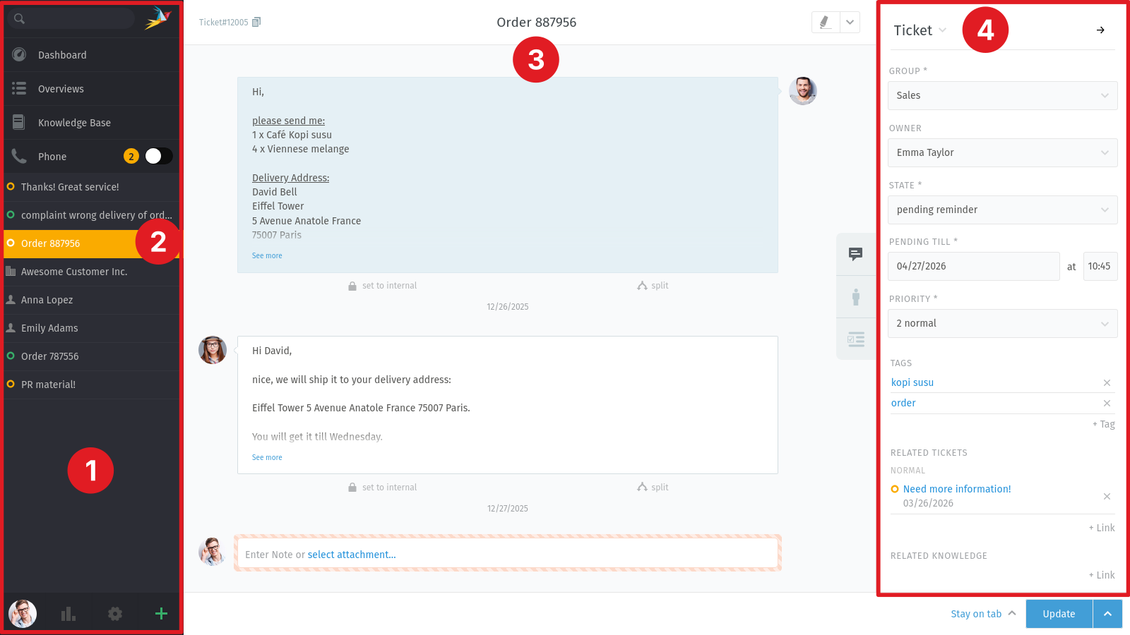
- Navigation sidebar (1)
This is the left sidebar which includes the search, notifications, overviews, ticket tabs, your avatar and the ticket create button.
- Navigation tab (2)
Each item of the navigation sidebar is called navigation tab. Depending on the content, it can be a ticket tab (with the ticket detail view) or the overview tab which opens the list of available overviews.
- Ticket detail view (3)
This is where you handle your customer requests. It is located in the middle of the screen if a ticket tab is selected in the navigation sidebar.
- Sidebar (4)
This is the right sidebar in the ticket detail view. It contains sidebar tabs like customers and checklists and displays the currently selected tab.
- Sidebar tabs (5)
On the left side of the sidebar, you can find small icons to switch between the different tabs. The availability of these tabs depends on your system configuration, your permissions and the ticket attributes (e.g. if the customer of the ticket has an assigned organization).
Navigation Sidebar
The navigation sidebar displays different areas. You might not see all of them because some depend on the configuration of your Zammad. The navigation sidebar is always visible. That means if you don’t know where you are, you can always go back to the dashboard, your overviews or an opened ticket, for example.
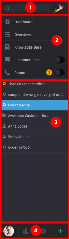
- Search and notification area (1)
Includes the search where you can search for users, organizations, tickets and basically every in Zammad available information. Next to the search you can find the Zammad logo. In case there is a notification, it shows you a badge with a count about how many notifications you got.
- Navigation (2)
Allows you to switch to different Zammad screens like the dashboard, overviews, knowledge base or phone screen.
- Content tabs (3)
You can find tabs for your opened tickets, users and organizations.
- Bottom bar (4)
Profile settings and create new ticket button. In case you have additional permissions, there might be a settings and a reporting button as well.
x
Sidebar
The sidebar on the right side displays all ticket relevant information and includes additional functionality. The most important one is the ticket sidebar. Switch between the different sidebars by clicking the desired tab on the left side of the sidebar. The available tabs are depending on the ticket and the configured features of your Zammad.
- Ticket tab
This tab shows the ticket information like owner, group, priority and state and lets you edit these values. Additionally, the following actions are available when you click on the Ticket header:
History: shows a dialog with the history in the current ticket. This is where you can find when and what actions was performed and by whom.
Merge: merge the ticket with another one in case a customer emailed you multiple times about the same issue.
Change customer: set another customer for the ticket.
- Customer tab
View customer details including a reference to the customer’s other tickets. You can change the ticket customer here as well by clicking on the Customer header and choose Change customer.
- Organization tab
This tab is only shown if the customer is member of an organization. It shows the organization’s details including all members. By clicking the Organization header, you can edit the name, the domain and the note of the organization.
Now that you know the basic UI elements and where to find them, read on in Ticket Basics.